- Product Upfront AI
- Posts
- Google's AI finally renders legible text in diagrams (this changes everything)
Google's AI finally renders legible text in diagrams (this changes everything)
Every AI image tool failed at one thing: readable labels. Nano Banana Pro fixed it. For educators, this is the unlock →

Welcome,
Ever tried to explain photosynthesis with a diagram and ended up with something that looks like a drunk toddler drew it in MS Paint?
Yeah, me too.
Here's the thing: Visual explanation is hard. Creating clear, accurate educational diagrams requires either:
Design skills you don't have
A designer you can't afford ($5K-15K for 100 custom diagrams)
200+ hours grinding in Photoshop
Low-quality stock images that barely explain anything
Until now.
Google has dropped Nano Banana Pro (powered by Gemini 3 Pro Image), and honestly?
It's the first AI image tool that actually understands what you're trying to teach, not just what you're trying to draw.
Check this out:
A biology teacher types: "Create an educational diagram of photosynthesis with labelled thylakoid membranes, light-dependent reactions, Calvin cycle, and legible text showing the flow from sunlight to glucose."
30 seconds later: Professional textbook-quality diagram. Perfect labels. Accurate science. Zero design skills required.

Cost: Basically free (a few cents per image).
Time saved: 4-6 hours per diagram.
But here's the part that actually matters—and why this is different from every other AI image tool you've tried...
🧠 Why Every Other AI Image Tool Failed Teachers (And How This One Doesn't)
You know what killed every previous AI image generator for educational use?
Text rendering.
Seriously. That's it.
You'd prompt Midjourney or DALL-E: "Create a diagram of the water cycle with labels for evaporation, condensation, precipitation, and collection."
What you'd get:
"Evuportion"
"Condensation"
Random squiggles that vaguely look like letters
Text overlapping itself
Labels floating nowhere near what they're supposed to label
Result: Completely useless for teaching.
A diagram without legible labels isn't educational. It's just decorative noise.
Nano Banana Pro fixed this.
How? By doing something genuinely clever: It thinks before it draws.
🎯 The Reasoning Engine (Why This Actually Works)
Here's what makes Nano Banana Pro different from every other image AI:
Traditional AI image models (Midjourney, Flux, old DALL-E):
You prompt → They generate pixels → Hope it looks right
Pure pattern matching from training data
No understanding of what you're actually trying to communicate
Nano Banana Pro's approach:
Reads your prompt and breaks it down semantically (What are you teaching? What concepts need to connect?)
Grounds in real knowledge via Google Search (fetches actual dates, verified facts, accurate data)
Plans the layout logically (Where should text go? How should arrows point? What needs emphasis?)
Then, renders using that structured plan
The result:
Text is actually legible (not garbled alphabet soup)
Diagrams are logically coherent (arrows point the right way)
Facts are accurate (real dates, verified data, correct science)
Example:
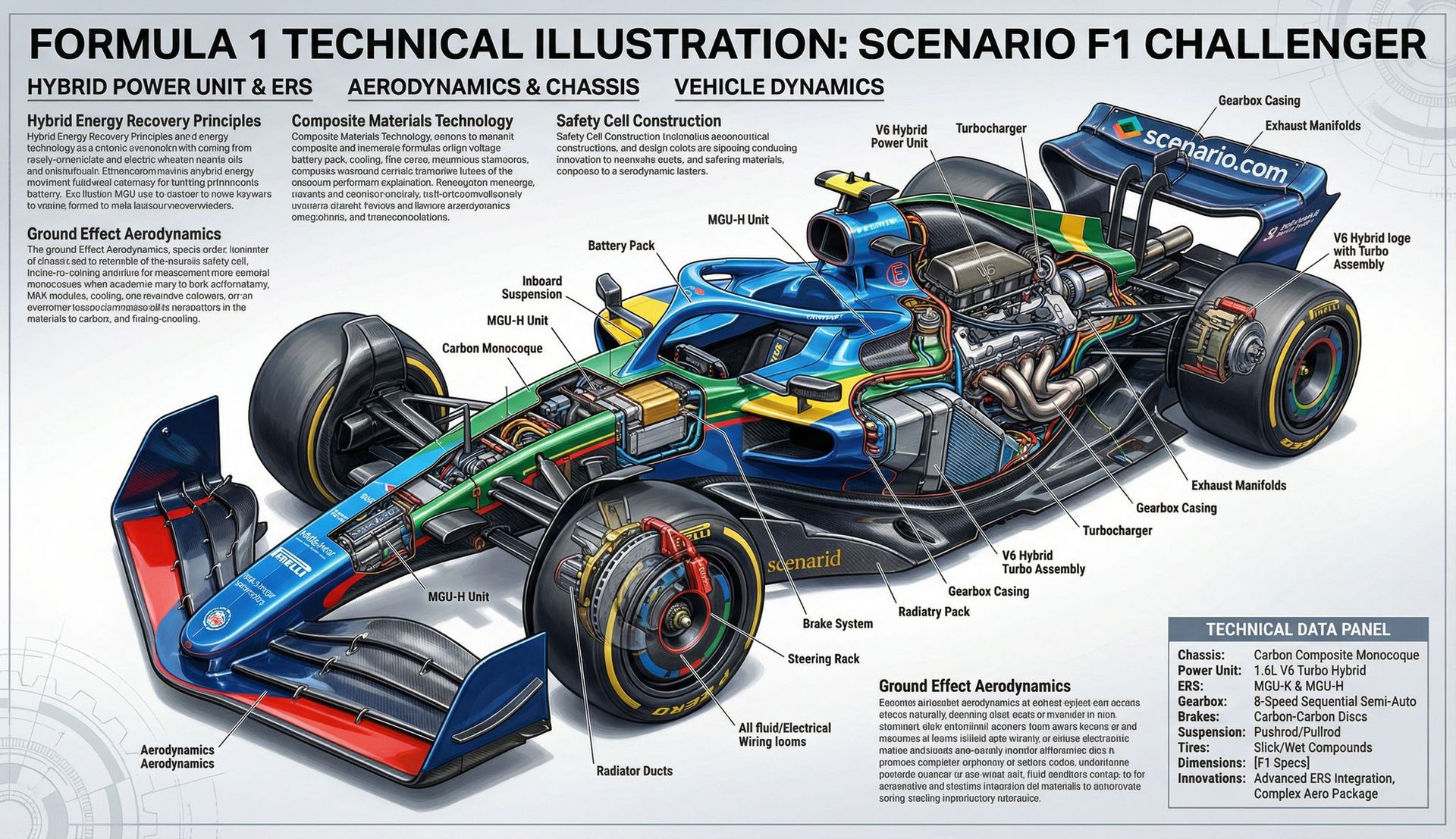
Someone prompted: "Create a technical diagram of an F-117 Nighthawk fighter jet with labeled components and arrows pointing to key parts."


Old models: Blurry jet, illegible scribbles where labels should be.
Nano Banana Pro: Crisp diagram where "Engine Inlet" is actually positioned on the engine, "Rudder" points to the rudder, and "Landing Gear" is correctly placed.
The AI understood that labels need to point to actual components. Not randomly float somewhere.
That's the difference between pattern matching and reasoning.
📚 What You Can Actually Do With This (Real Examples)
Use Case 1: Text-to-Infographic in 30 Seconds
Scenario: High school biology teacher needs to explain photosynthesis.
Old method:
Hire designer ($500-1,000)
OR spend 4-6 hours in Photoshop
OR use a terrible stock diagram that barely explains anything
Nano Banana Pro method:
Prompt:
Create an educational infographic explaining photosynthesis.
- Top: Sun with light energy entering
- Left: Thylakoid membrane showing light-dependent reactions
  (H2O splitting → O2 + ATP + NADPH)
- Right: Stroma showing Calvin Cycle
  (CO2 → Glucose using ATP and NADPH)
- Bottom: Summary equation
Style: Clean, flat vector. Color-coded greens/yellows/blues.
High school textbook quality.
Time: 30 seconds
Cost: $0.02
Quality: Publication-ready
Time saved: 4-6 hours per diagram.
If you create 10 diagrams per semester? That's 40-60 hours saved.
Use Case 2: Whiteboard Sketch → Professional Diagram
This one's wild.
The workflow:
Brainstorm on whiteboard (messy, rough, handwritten labels)
Take a photo
Upload to Nano Banana Pro with prompt: "Convert this whiteboard sketch into a professional vector diagram with clean typography and aligned boxes"
Get back a polished, presentation-ready version
Real example:
Data scientist sketches ML pipeline on whiteboard:
Raw Data → Cleaning → Feature Engineering → Model Training → Evaluation → Deployment
Takes photo. Uploads.
Prompt:
Convert this whiteboard flowchart into professional diagram.
- Align all boxes to grid
- Use straight arrows (90-degree angles)
- Clean sans-serif font
- Tech-forward color palette (dark blue, light gray)
- Modern, minimalist style
Result: Professional flowchart in 30 seconds.
Manual conversion in Photoshop: 1-2 hours.
Scaling this: 10 diagrams per semester = 10-20 hours saved.
Use Case 3: Data Storytelling (The Journalist's Dream)
Public health nonprofit needs to communicate "Top 10 Causes of Death Worldwide."
Prompt:
Create infographic showing top 10 global causes of death.
Horizontal bar chart:
- Rank (1-10)
- Cause name (Coronary Heart Disease, Stroke, etc.)
- Deaths per year (millions)
- Percentage of total deaths
Top 3 highlighted in bold.
Data sourced from WHO Global Health Observatory.
Style: Clean, professional, public health campaign.
What happens:
Nano Banana Pro fetches real WHO data via Google Search
Generates accurate, professional infographic
Text is legible even when shared on social media
Someone scrolling understands global health priorities in 5 seconds
Old method:
Manually research WHO data (30 min)
Layout in Illustrator (2-3 hours)
Multiple rounds of edits
New method:
One prompt (5 min)
Done
🚨 The Limitations Nobody Talks About (Honest Take)
Okay, real talk. Nano Banana Pro isn't perfect. Here's what breaks:
1. Multi-Step Edits (Often Fail)
What works:
First-pass generation (usually great)
What fails:
"Now move the text box up"
"Now add another person"
"Now change the colours to blue"
After 1-2 edits, the model often:
Outputs the original unchanged (claims it made changes, didn't)
Introduces new errors (previously perfect text becomes garbled)
Loses coherence
Why? It's designed for single-pass generation, not iterative editing.
Solution: Get it right on the first prompt. Spend extra time crafting detailed instructions upfront.
For final tweaks? Use Figma or Photoshop.
2. Text Rendering (Good, Not Perfect)
What works well:
Clean fonts (Arial, Roboto)
1-5 word labels
Common languages (English, Spanish, French, Mandarin)
What often fails:
Decorative/script fonts (text melts)
Very small text (below 8pt gets fuzzy)
Uncommon languages or scripts
Complex text wrapping inside shapes
Workaround: Keep text simple, large, and in standard fonts.
3. Recent Data (Can Be Outdated)
What works:
Well-documented historical events
Established scientific concepts
Current weather/news via Google Search
What can fail:
Very recent events (last week's news might not be indexed)
Niche statistics
Proprietary company data
Solution: For time-sensitive or statistics-heavy diagrams, include exact data in your prompt. Don't rely on the model to "just know."
One Last Thing….
Nano Banana Pro represents a genuine shift:
The commoditization of visual explanation.
Previously, turning complex ideas into clear diagrams required scarce skills (designer, illustrator).
Now? It's a scalable prompt.
For educators:
No more hiring designers
No more grinding in Photoshop
Focus on pedagogy, not production
For course creators:
Create 10x more content
In 1/10 the time
At near-zero cost
For data storytellers:
Turn research into shareable visuals
Maintain factual accuracy
Scale your output dramatically
The gap between "I know" and "I have visual content" just collapsed to 30 seconds.
Whether you use it or not is up to you.
But the educators who figure this out early? They're gonna have a massive production advantage.
P.S. - Want to try this yourself?
Nano Banana Pro is available now via Google AI Studio or in the Gemini app.
Start with something simple, a basic flowchart or timeline and see how it handles text rendering.

Reply